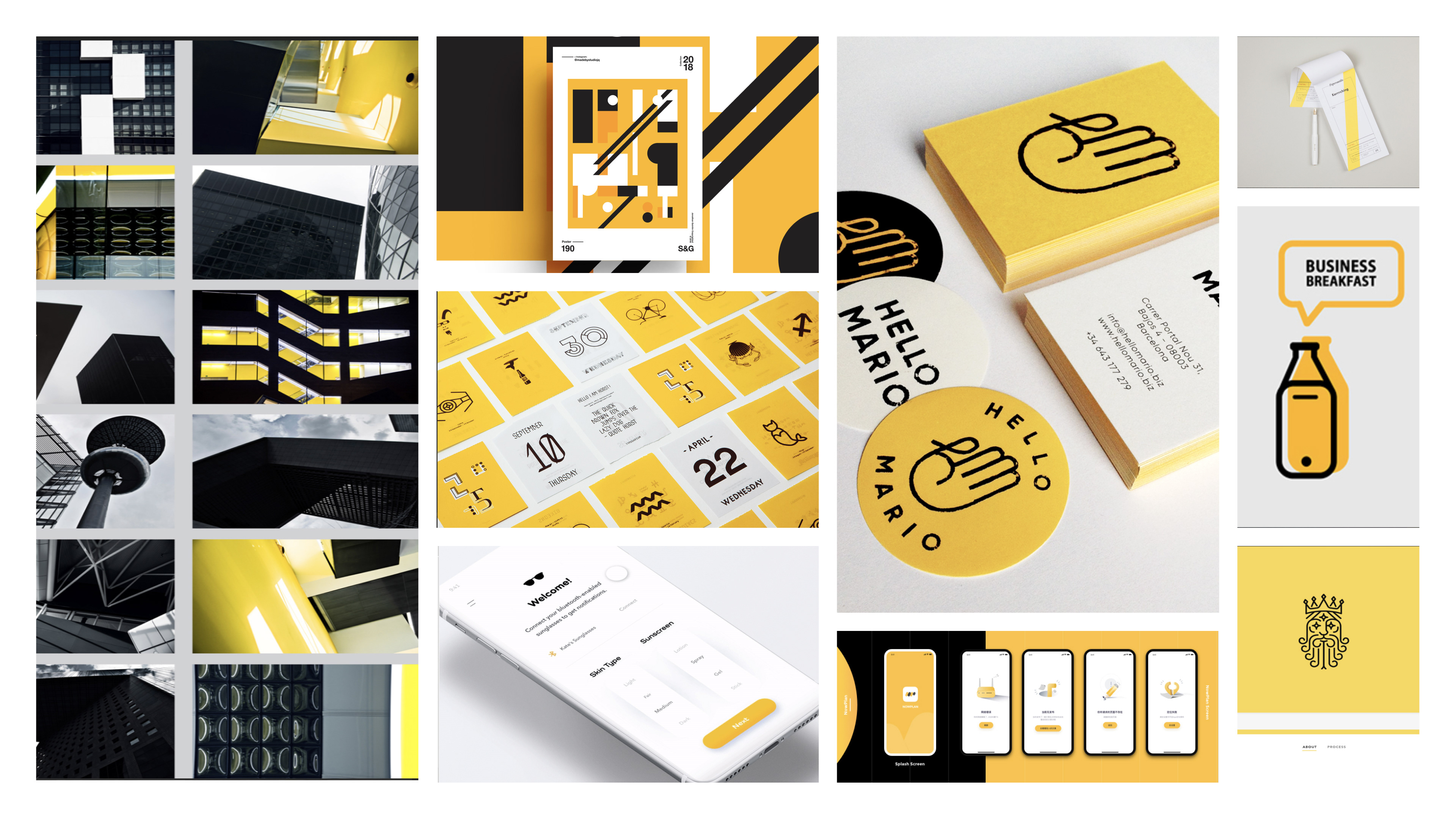
Mood board Inspiration
Given the urgency (and potential for hanger involved with searching for restaurants), I chose to stick with clean, geometric lines, with an underlapping bright yellow for importance, as seen in the far right image with the "Business for Breakfast" bottle.
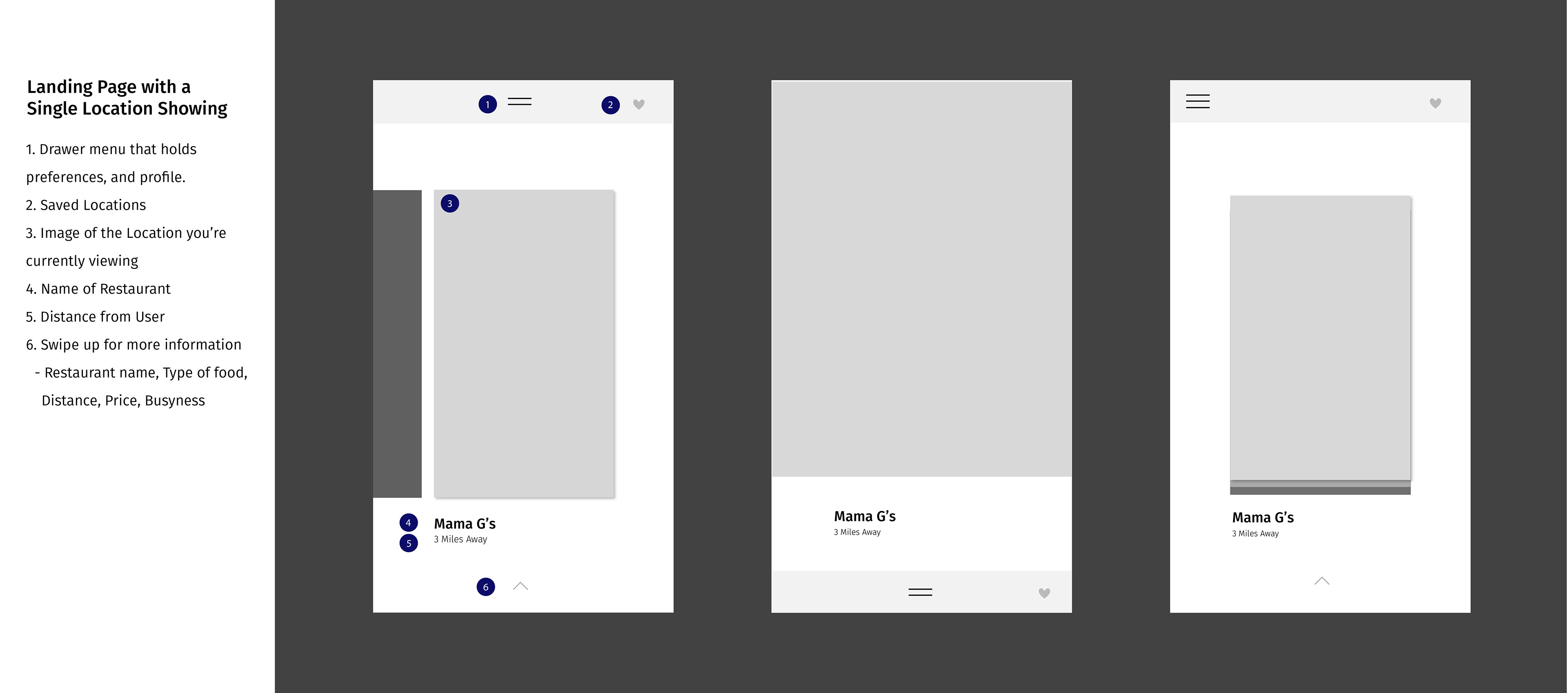
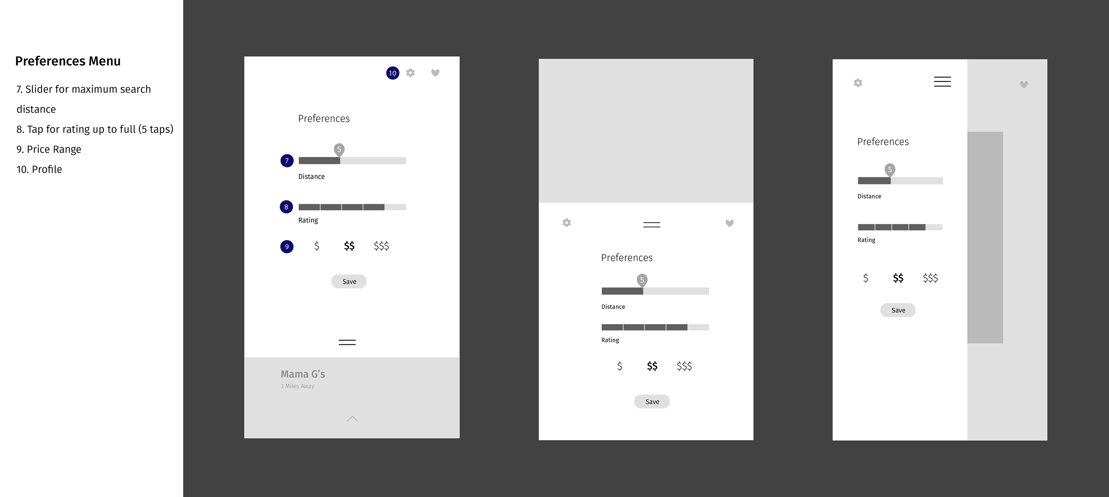
Wireframes
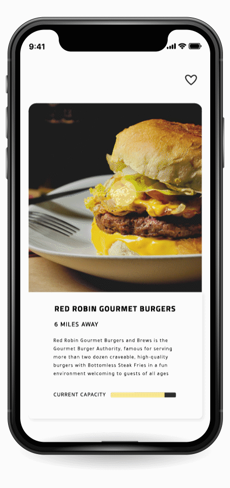
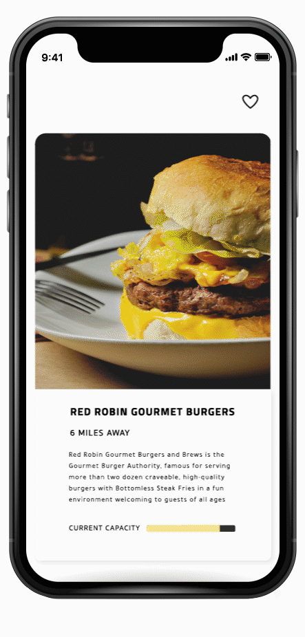
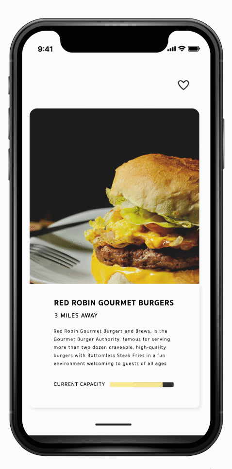
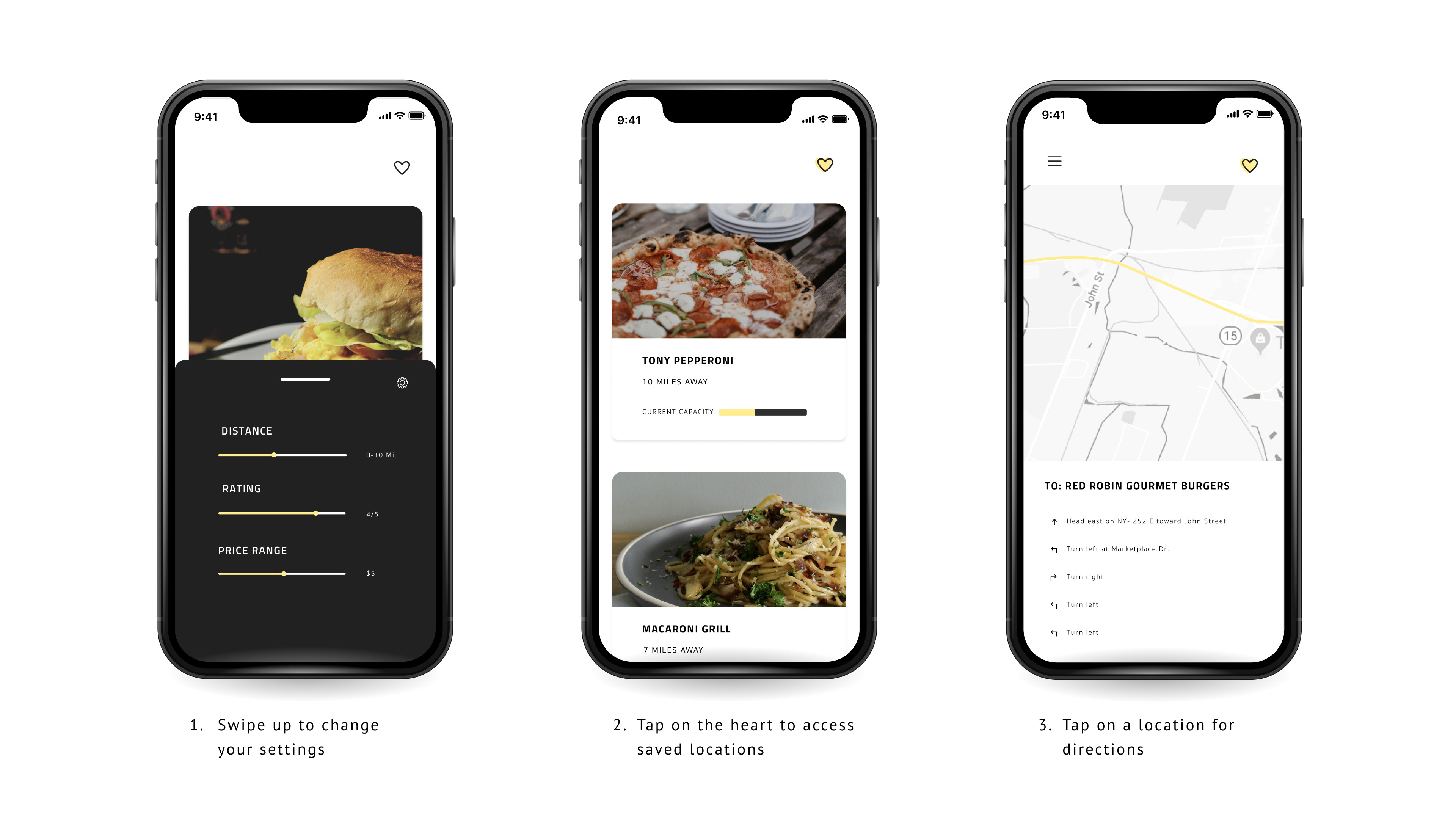
Below you will find annotated wireframes. For my final designs, I chose to combine a few designs. I took the simplicity of a single image for the landing page, the container that slid from the bottom for the preferences menu, and a single location in a row for favorited locations, relating the home screen to the favorited screen visually.

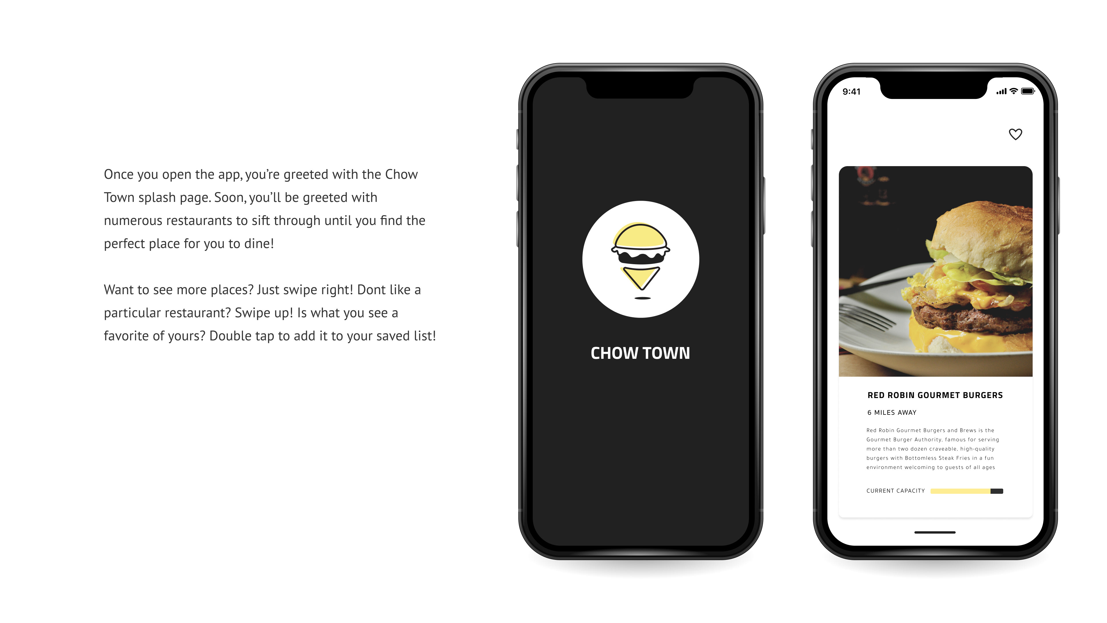
Screen Interactions